Chapter 7 Fluctuation–timelines
library(tidyverse)7.1 Multiple time series
two lines on one plot and problems faceting
7.2 Time series with reference line
## Reference lines in time series
belts = Seatbelts
belts.df = as.data.frame(
  cbind(Year = round(trunc(time(belts)), 1),
        Month = cycle(belts),
        belts))

belts.df$belts.law = as.factor(belts.df$belts.law)
belts.DriversKilled.bymonth = belts.df %>% group_by(Month) %>%
  summarise(mean.DriversKilled = mean(belts.DriversKilled))

ggplot(belts.df, aes(x = Month, y = belts.DriversKilled)) +
  geom_line(aes(colour = belts.law, group = Year)) +
  geom_line(data = belts.DriversKilled.bymonth,
            aes(x = Month, y = mean.DriversKilled)) +
  facet_wrap(~Year, nrow= 4, ncol= 4) +
  theme_bw() +
  theme(axis.text.x = element_blank(),
        axis.ticks.x = element_blank(),
        legend.position = "none")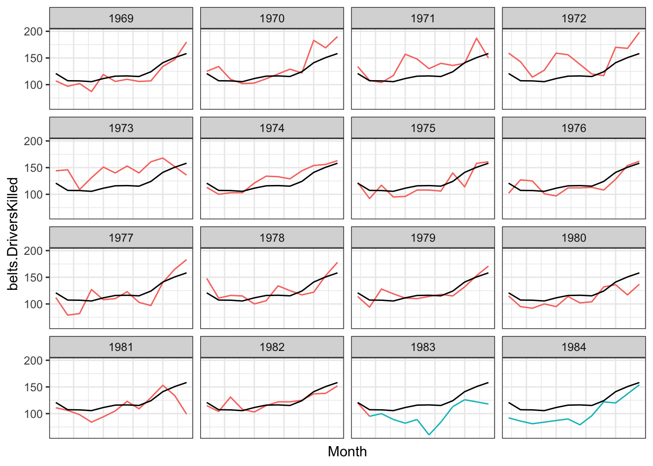
belts.df = belts.df %>% group_by(Year) %>% mutate(summer.s=Month[Month==5], summer.e=Month[Month==9])

ggplot(belts.df, aes(Month, belts.DriversKilled)) +
    geom_rect(aes(xmin=summer.s, xmax=summer.e, ymin=-Inf, ymax=+Inf),
                 fill = "white") +
  geom_path(aes(colour = belts.law, size = belts.PetrolPrice, group = Year), lineend = "round") +
    geom_line(data = belts.DriversKilled.bymonth,  aes(x = Month, y = mean.DriversKilled)) +
facet_wrap(~Year, nrow= 4, ncol= 4) 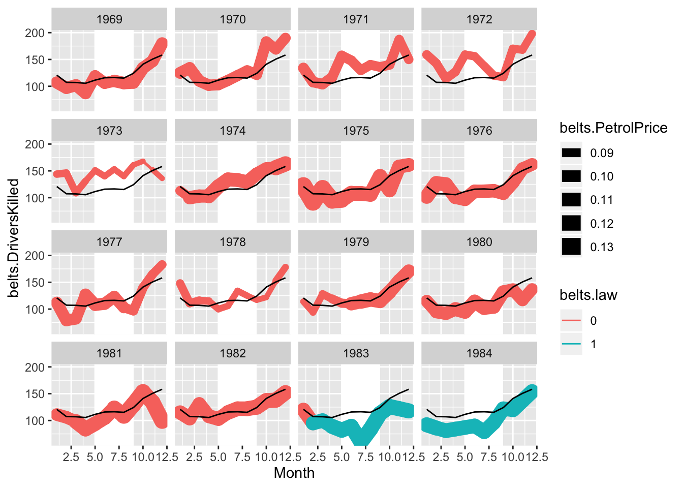
7.3 Cycle plot
Cycle plot make comparions between months easy. Showing bars rather than lines helps focus attenton the specitic years when the seatbelt law was enacted.
hline.df <- belts.df %>% group_by(Month) %>% summarize(m.killed = mean(belts.DriversKilled))


ggplot() +
  geom_path(data = belts.df, aes(x = Year, y = belts.DriversKilled, group = Month, color = belts.law), alpha = .6) +
  geom_hline( data = hline.df, aes(yintercept = m.killed), colour = "grey15", size = 1.5) +
  facet_grid(~Month) +
  theme(axis.text.x = element_blank())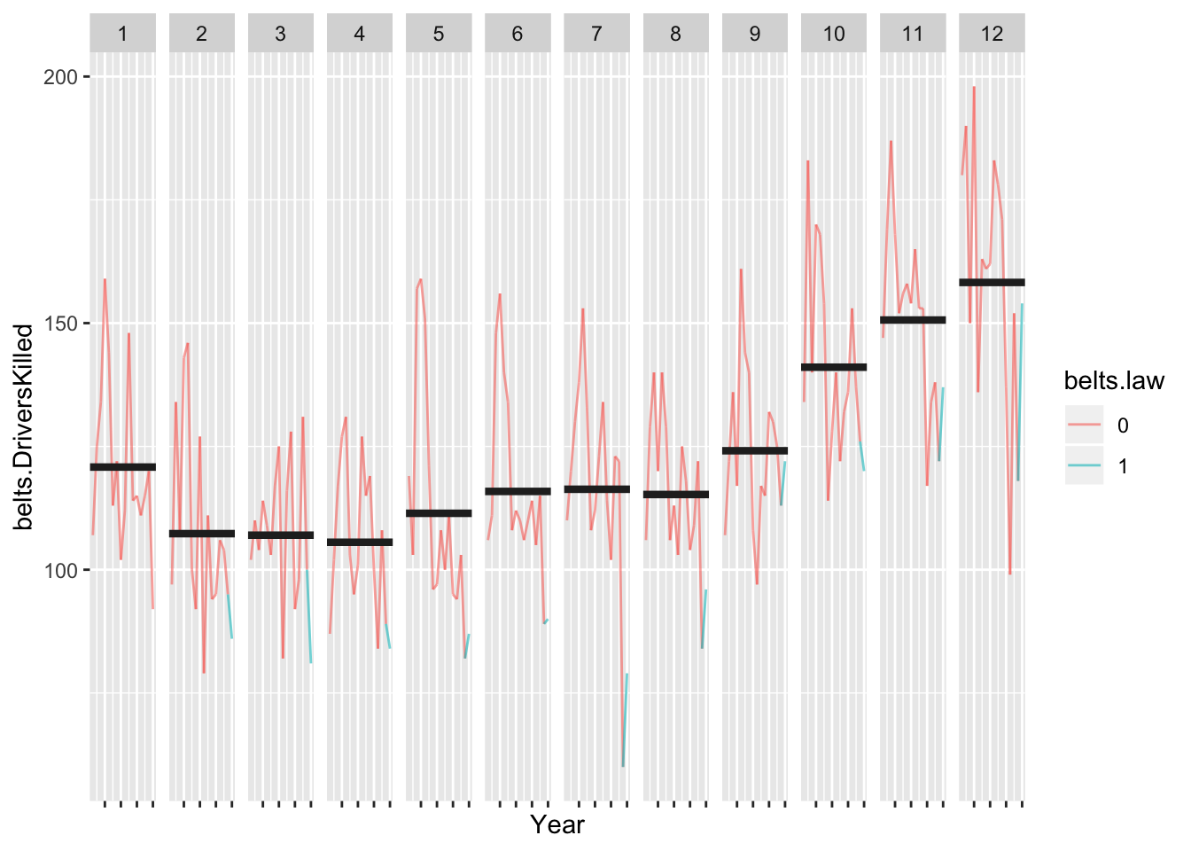
ggplot() +
  geom_bar(data = belts.df, aes(x = Year, y = belts.DriversKilled, group = Month, fill = belts.law), alpha = .6,
    stat = "identity") +
  geom_hline( data = hline.df, aes(yintercept = m.killed), colour = "grey15", size = 1.5) +
  facet_grid(~Month) +
  theme(axis.text.x = element_blank())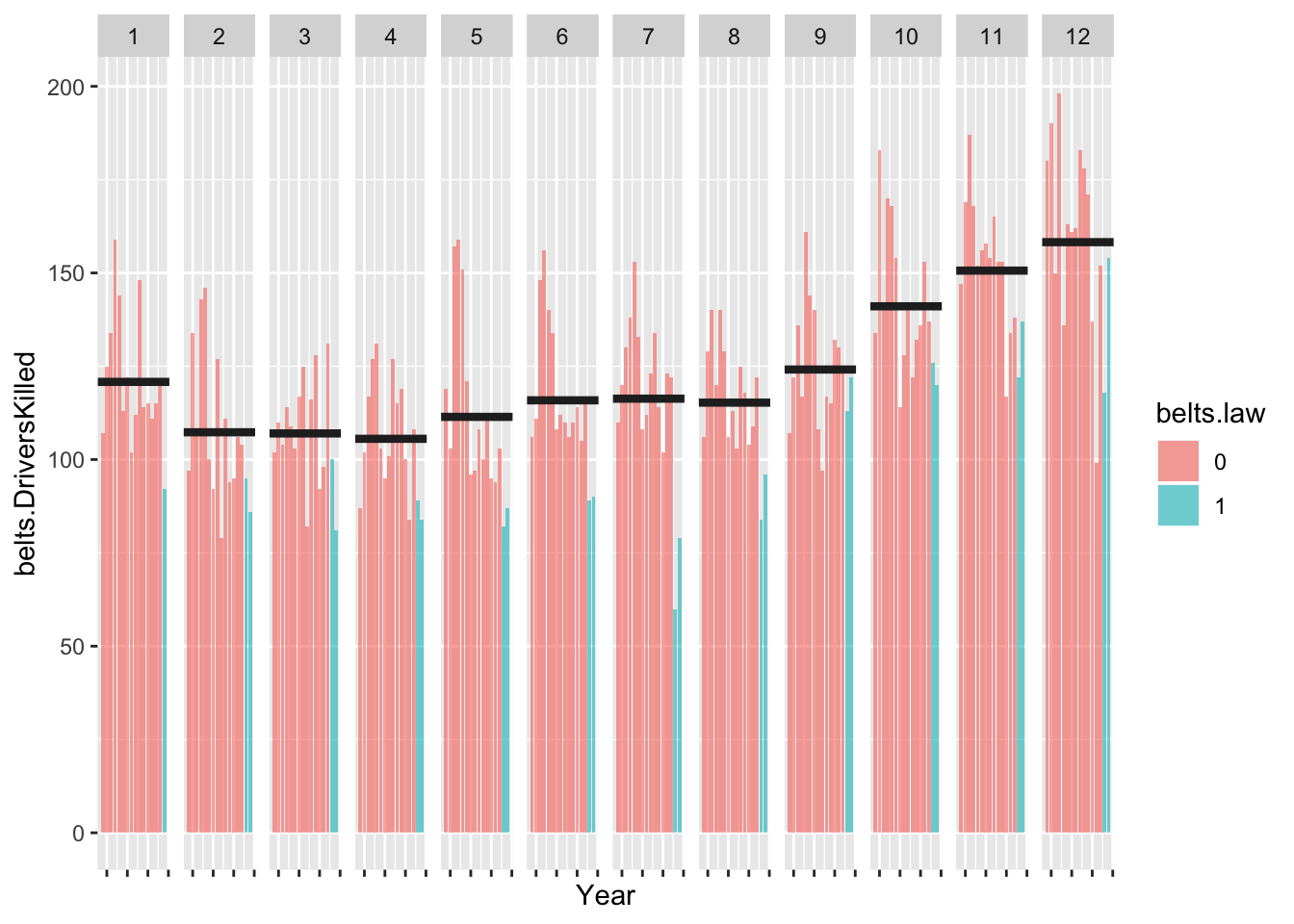
7.4 Connected scatterplot
year.belts.df = belts.df %>% group_by(Year) %>%
  summarise(m.drivers = mean(belts.drivers), m.killed = mean(belts.DriversKilled),
  law = last(belts.law))

ggplot(data = year.belts.df, aes(x = m.drivers, y = m.killed)) +
  geom_path(aes(alpha = Year)) +
  geom_text(aes(label = Year, colour = law))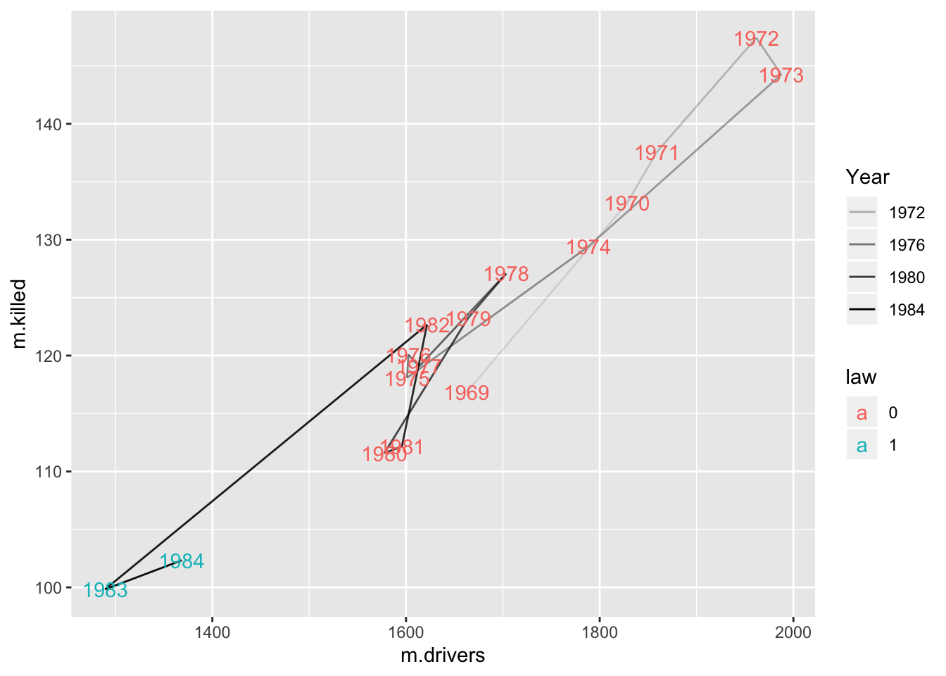
7.5 Step graph
TODO
7.6 Faceted zoom
library(ggforce)
## Examples from: https://cran.r-project.org/web/packages/ggforce/vignettes/Visual_Guide.html

ggplot(iris, aes(Petal.Length, Petal.Width, colour = Species)) +
    geom_point() +
    facet_zoom(x = Species == "versicolor")+
    labs(title = "ggforce: facet zoom")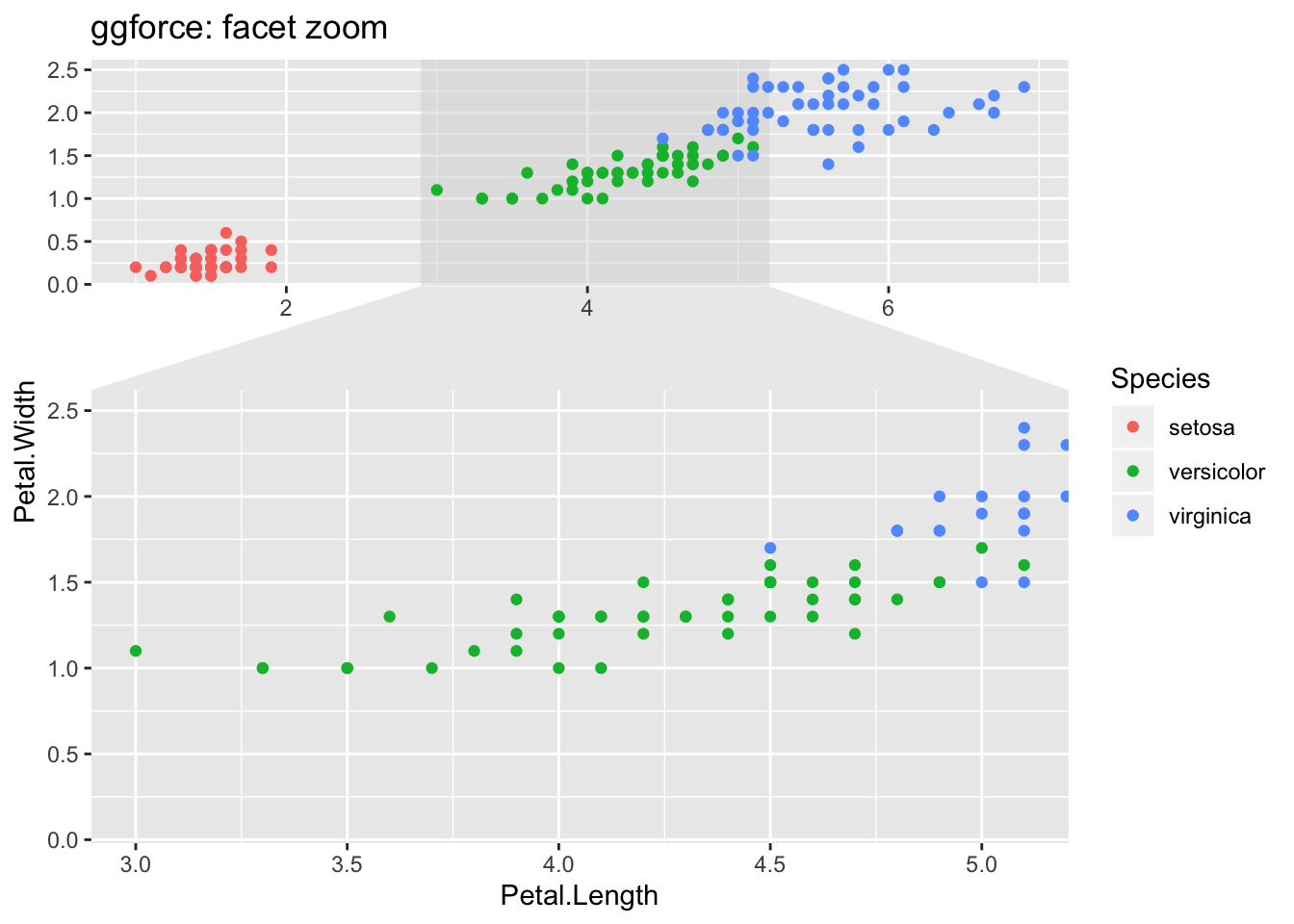
7.7 Ridge plot
https://cran.r-project.org/web/packages/ggridges/vignettes/gallery.html
## Ridge plot
library(ggridges)
library(ggplot2movies)

movies %>% filter(year>1912, length<250) %>%
ggplot(aes(x = length, y = year, group = year)) +
  geom_density_ridges(scale = 10, size = 0.25, rel_min_height = 0.03, alpha=.75) +
  scale_x_continuous(limits=c(0, 250), expand = c(0.01, 0)) +
  scale_y_reverse(breaks=c(2000, 1980, 1960, 1940, 1920, 1900), expand = c(0.01, 0)) +
  theme_ridges()
## Picking joint bandwidth of 6.89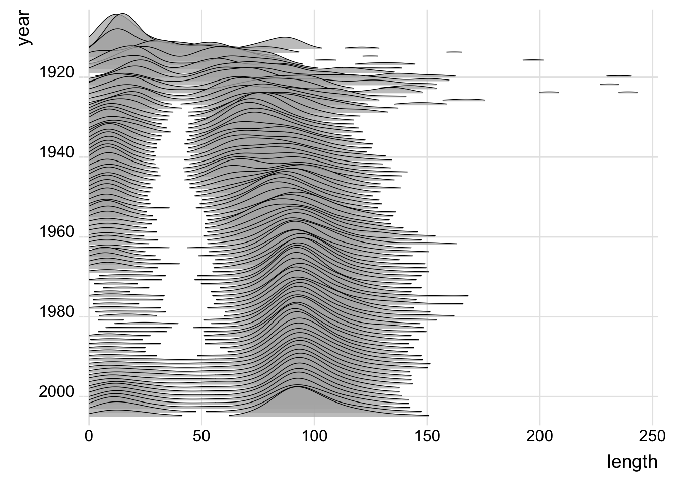
7.8 Stacked area and line graphs
Challenges of comparing individual contributions, ease of seeing combined effect Stream plot
"Streamgraphs are a generalization of stacked area graphs where the baseline is free. By shifting the baseline, it is possible to minimize the change in slope (or wiggle) in individual series, thereby making it easier to perceive the thickness of any given layer across the data. Byron & Wattenberg describe several streamgraph algorithms in ’Stacked Graphs—Geometry & Aesthetics[http://www.leebyron.com/else/streamgraph/]’"[Bostock. http://bl.ocks.org/mbostock/4060954]
“A steamgraph is a more aesthetically appealing version of a stacked area chart. It tries to highlight the changes in the data by placing the groups with the most variance on the edges, and the groups with the least variance towards the centre. This feature in conjunction with the centred alignment of each of the contributing areas makes it easier for the viewer to compare the contribution of any of the components across time.”
#devtools::install_github('Ather-Energy/ggTimeSeries')
library(babynames)
library(ggTimeSeries)

names.df = babynames %>%
  filter(grepl("^Jo", name)) %>%
  group_by(year, name) %>%
  tally(wt=n)
##TODO smooth sequence

ggplot(names.df, aes(year, y = n, group = name, fill = name)) +
  stat_steamgraph() +
  labs(x = "", y = "") +
  scale_x_continuous(expand = c(0, 0)) +
  theme_minimal() +
  theme(legend.position = "none",
        axis.text.y=element_blank())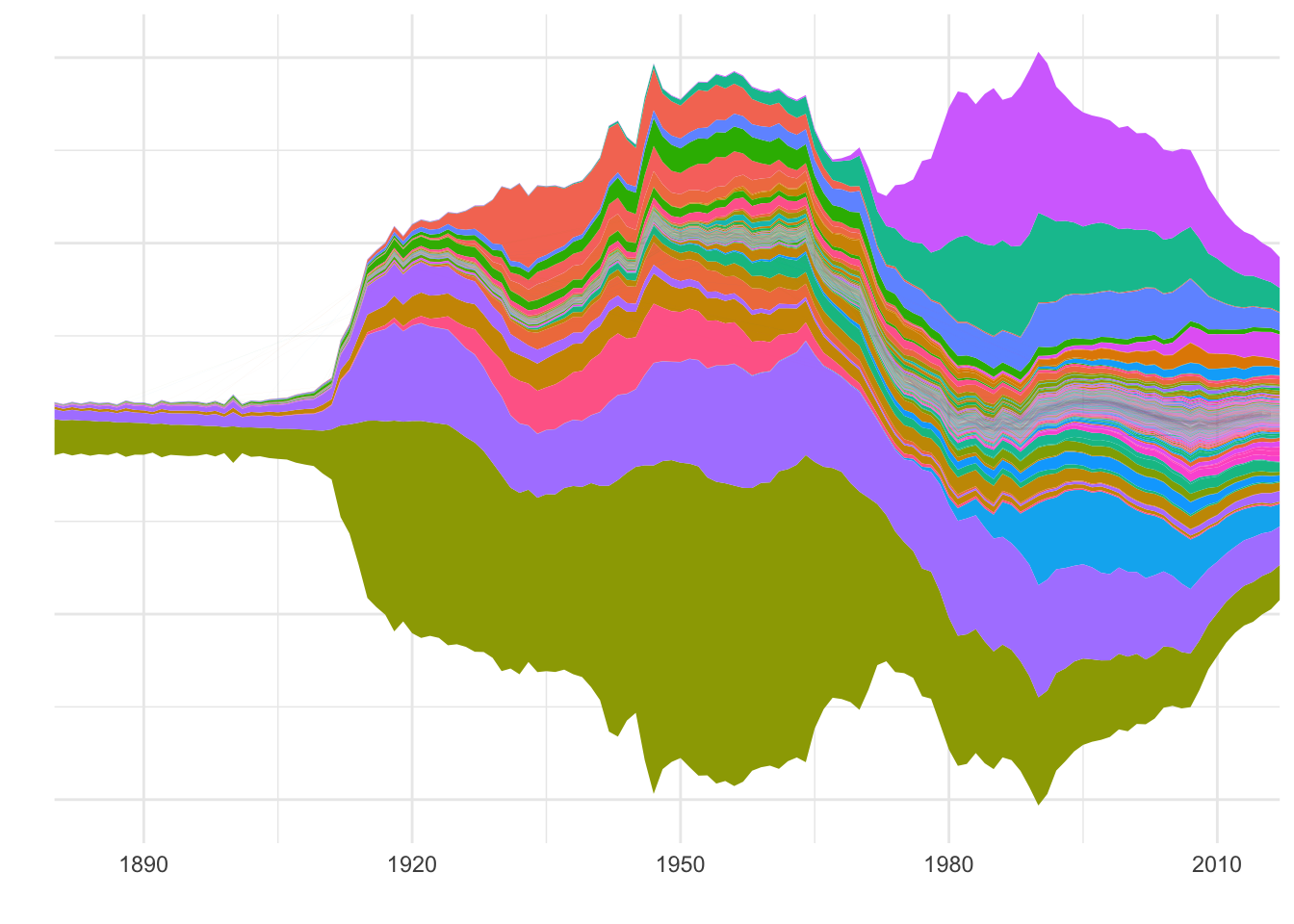
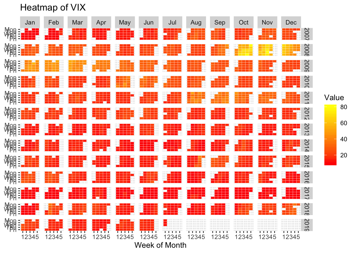
7.9 Temporal heatmap
TODO replace with rain data for SEA from https://www.r-bloggers.com/ggplot2-time-series-heatmaps-revisited-in-the-tidyverse/
# The core idea is to transform the data such that one can
# plot "Value" as a function of "WeekOfMonth" versus "DayOfWeek"
# and facet this Year versus Month

xts_heatmap <- function(x){
  data.frame(Date=as.Date(index(x)), x[,1]) %>%
    setNames(c("Date","Value")) %>%
    dplyr::mutate(
      Year=lubridate::year(Date),
      Month=lubridate::month(Date),
      # I use factors here to get plot ordering in the right order
      # without worrying about locale
      MonthTag=factor(Month,levels=as.character(1:12),
                      labels=c("Jan","Feb","Mar","Apr","May","Jun","Jul","Aug","Sep","Oct","Nov","Dec"),ordered=TRUE),
      # week start on Monday in my world
      Wday=lubridate::wday(Date,week_start=1),
      # the rev reverse here is just for the plotting order
      WdayTag=factor(Wday,levels=rev(1:7),labels=rev(c("Mon","Tue","Wed","Thu","Fri","Sat","Sun")),ordered=TRUE),
      Week=as.numeric(format(Date,"%W"))
    ) %>%
    # ok here we group by year and month and then calculate the week of the month
    # we are currently in
    dplyr::group_by(Year,Month) %>%
    dplyr::mutate(Wmonth=1+Week-min(Week)) %>%
    dplyr::ungroup() %>%
    ggplot(aes(x=Wmonth, y=WdayTag, fill = Value)) +
    geom_tile(colour = "white") +
    facet_grid(Year~MonthTag) +
    scale_fill_gradient(low="red", high="yellow") +
    labs(x="Week of Month", y=NULL)
}

require(quantmod)
# Download some Data, e.g. the CBOE VIX
quantmod::getSymbols("^VIX",src="yahoo")
## [1] "^VIX"xts_heatmap(Cl(VIX)) + labs(title="Heatmap of VIX")